Wed Jun 24 2020
...
FastComments on Mobile - Less Whitespace More Content
The Problem
When we first launched FastComments, we aimed for a sleek design that worked well on both mobile and desktop browsers. However, as we incorporated more features and observed user interactions with FastComments, we realized that we were wasting screen space on our mobile UI in our efforts to make it "attractive".
So we've reached a compromise.
The Solution
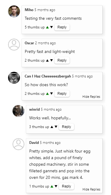
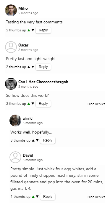
As you can see in the before image, we did not use space very efficiently.

Now, we have traded vertical screen space for horizontal screen space.

Customization Rule Implications
We're aware that when we make styling changes to the public-facing comment widget, we may disrupt our customers' customizations. Don't worry, we've got you covered and have reviewed everyone's custom widget styling to ensure it remains intact. However, if you're experiencing issues, please let us know.
Performance Implications
This change has increased the widget size by about 300 bytes, resulting in a total of 10.1kb. As with all releases that expand the size of the widget, we'll be exploring ways to reduce it again.
Happy commenting!
