Wed Jun 24 2020
...
FastComments on Mobile - Less Whitespace More Content
The Problem
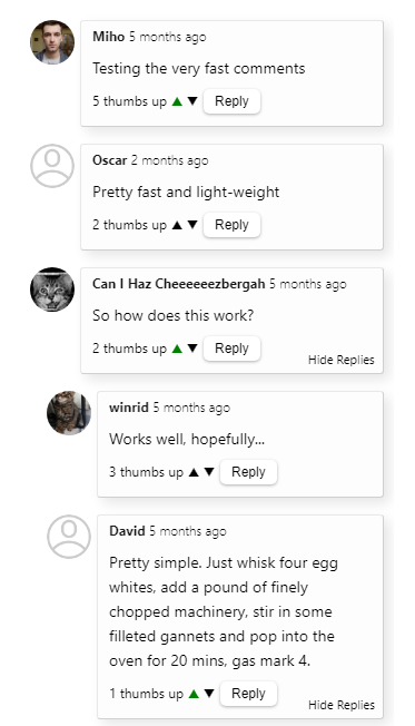
When we first released FastComments we wanted a slick design that worked well on mobile and on desktop browsers. However, as we added more features and saw users interact with FastComments we realized that we were wasting screen real-estate on our mobile UI while trying to make it "pretty".
So we've come up with a compromise.
The Solution
Here you can see before, we did not use space very efficiently.

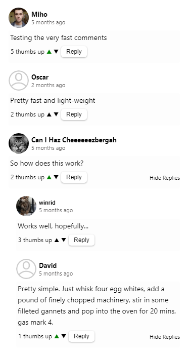
Now, we have exchanged vertical screen space for horizontal screen space.

Customization Rule Implications
We're aware that when we make styling changes to the public facing comment widget, we can break our customers' customizations. Don't worry, we have you covered and have gone through everyone's custom widget styling to make sure it is not broken. However, if you are seeing issues then let us know.
Performance Implications
This change has increased the widget size by about 300 bytes, bringing it to a total of 10.1kb. As with all releases that increase the size of the widget we'll be looking into ways to bring it back down.
Happy commenting!
