Mon Jun 21 2021
...
FastComments Gets a New Look
! This Article Contains Technical Jargon
A New Look
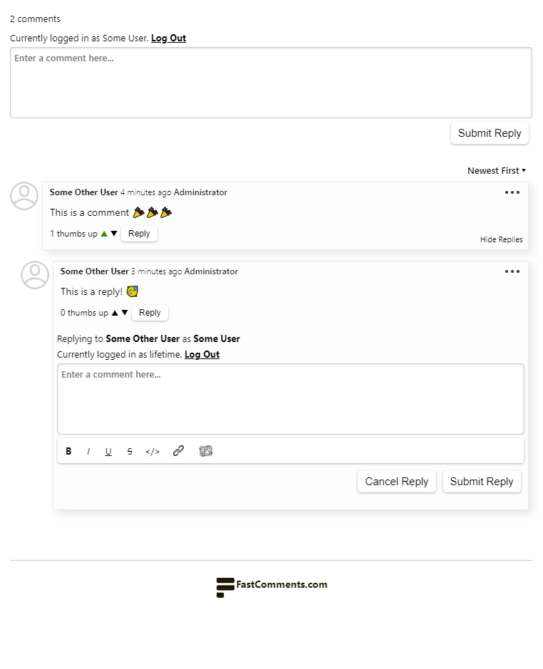
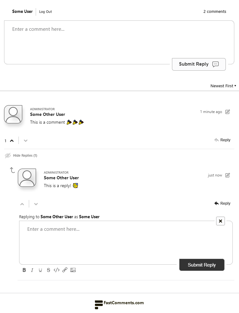
Until today, the look and feel of the FastComments comment widget has only incrementally evolved. Today, we're releasing a whole new version!
Check out the comparison below (drag the slider to compare):


Existing Customers
Since much of our user base customizes the comment widget, we have kept the new UI completely separate. You should see no changes until you are migrated.
Who Gets It
New customers that sign up as of today will automatically get the new design. All of our frameworks, libraries, and plugins have received updates to incorporate the new version of the FastComments comment widget.
Previous Version End of Life
We are not currently setting an end of life of the previous version of the comment widget. This does not mean we will not announce one in the future. However, when we do we will give a reasonable margin (6 - 12 months from announcement to deprecation).
Our automated testing suite has been updated to support different versions of the comment widget so that the previous version will still receive continuous automated testing.
Dark Mode & Other Features
The new design supports dark mode, just like original comment widget. All feature flags and settings have been migrated.
In terms of Dark Mode, with the old comment UI, the assets for Dark Mode were always included on page load even if they were not used. This was about an extra 2kb that was always downloaded to the client - even if it was not needed.
The new version of the comment widget only fetches these assets, including styling, if needed.
Default Avatar
The default avatar used in the new UI is different. Upon migrating, the default avatar used throughout the product in the admin dashboard and all notification emails will also be updated.
Customization Rule Implications
We're aware that when we make styling changes to the public facing comment widget, we can break our customers' customizations. Don't worry, we have you covered and have gone through everyone's custom widget styling to make sure it has not regressed. However, if you are seeing issues then let us know.
Performance Implications
The total size of the comment widget increased from 15.4kb to 17.4kb. While we think a slight increase in bundle size for how much better the UI looks is worth it, we have planned measures in place to drop this back down.
Overall, the new UI loads faster, since more assets are now bundled together, thus resulting in fewer requests.
How to Migrate
Via Support
Simply reach out to your support representative, or start the conversation here.
WordPress
If you're running WordPress, simply upgrade to the latest version and update any custom styling you may have.
Custom Integrations
If you're using the VanillaJS comment widget, simply change:
<script src="https://cdn.fastcomments.com/js/embed.min.js"></script>
To:
<script src="https://cdn.fastcomments.com/js/embed-v2.min.js"></script>
If you're using the React, Angular, or Vue libraries simply upgrade to version 2.
Some Nerdy Stats
From conception, design, and implementation, this was a two-month-long project that spanned across 100+ files and changed over nine thousand lines of code.
We've also completely re-vamped our build system to be able to have a shared code base between versions of the comment widget. This system allows us to use compile time expressions to only include code for the appropriate version of the UI, lowering the size of the widget bundle.
Forward Thinking
The previous design lasted us from 2019 until mid 2021. We're hoping this new look carries us further into the future, and our new infrastructure for managing multiple versions of the comment UI will allow FastComments to grow without interruption to our customer base over time.
Happy commenting!
